About this component
Related guides
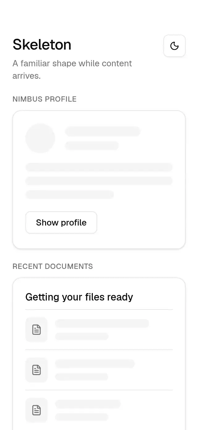
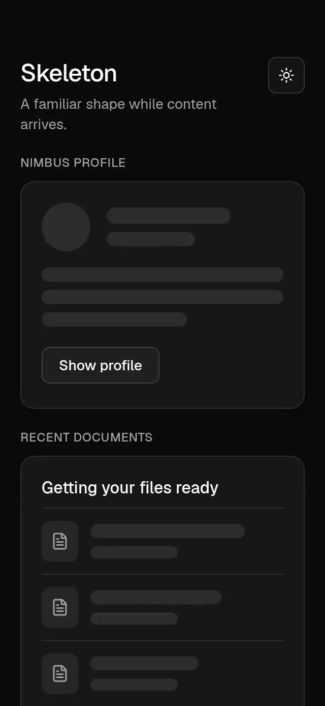
Synchronized loading placeholders with configurable width, height, corner radius, and theme.
How it works
- Blocks use the shared accent surface and medium radius, or a full radius for circles.
- One module-level UI clock drives every block, including blocks mounted later.
- Opacity pulses from 1 to 0.5 and back in 2 seconds with the cubic curve (0.4, 0, 0.6, 1).
- The clock stops when its last animated subscriber unmounts. Text groups end with a 60% line.
Install
npx nativeanimation add base-skeletonThe CLI also copies base-theme. Dependencies, if you copy by hand:
npx expo install react-native-reanimated react-native-workletsUsage
import { BaseSkeleton, BaseSkeletonText } from './base-skeleton';

<View style={{ gap: 12 }}>
  <BaseSkeleton circle width={48} height={48} />
  <BaseSkeleton width="70%" height={18} />
  <BaseSkeletonText lines={3} />
</View><BaseSkeleton width="100%" height={120} radius={theme.radius.xl} />
<BaseSkeletonText lines={4} lineHeight={16} style={{ gap: 10 }} />BaseSkeletonText also takes width, radius, style, theme, and testID. Its style applies to the group, while its last line is always 60% wide. Keep layout space stable when replacing placeholders with content.
Wrap your app in BaseThemeProvider (from base-theme) to choose light/dark and an accent; without it, pieces use the light neutral theme. The theme prop overrides the provider. Load the font families declared in your theme once in the host app.
Props
| Prop | Type | Default | Description |
|---|---|---|---|
width / height | DimensionValue | '100%' / 16 | Block dimensions; use equal dimensions for a circle. |
radius | number | theme.radius.md | Corner radius in pt. |
circle | boolean | false | Uses the full theme radius. |
lines | number | 3 | BaseSkeletonText only: number of lines. |
lineHeight | number | 14 | BaseSkeletonText only: height of each line. |
theme | BaseTheme | provider | Overrides the shared family theme. |
style | StyleProp<ViewStyle> | — | Container style. |
testID | string | — | Stable test identifier. |
Compatibility
Expo SDK 58 · React Native 0.88 · Reanimated 4.7 · react-native-worklets 0.13. Runs on iOS, Android and web, in Expo Go and development builds. Part of Native Animation Base, a free family that shares one theme.
Accessibility
Decorative blocks are hidden from accessibility. Put a loading label and busy state on the surrounding content region. Reduce Motion uses a static opacity of 0.7 and does not subscribe to the pulse clock.
Part of a shared foundation
Use it in a screen
Compose Base Skeleton with other Base components and a single shared theme. Ask your agent to read each API, then connect real navigation, state, and callbacks.
Go further.
Base covers the everyday. Choose a more expressive interaction when your app calls for it.
Streaming Skeleton Shell ↗
A streaming app shell with shared loading shimmer and card-to-hero transitions, with configurable titles, labels, colors, and fonts.
Another way to solve this task · $9Social Feed Skeleton ↗
A pull-to-refresh feed with shared shimmer and staggered post reveals, with configurable posts, labels, colors, and font.
Source code
Loading public source…