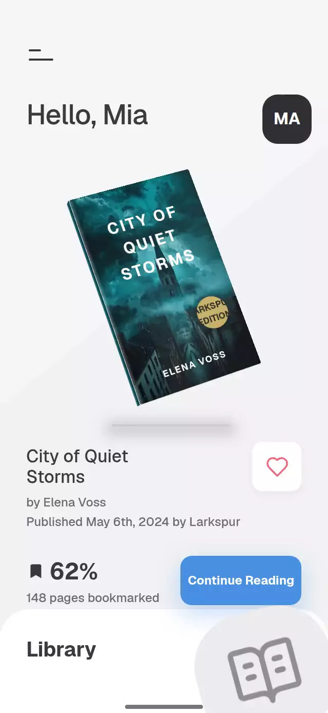
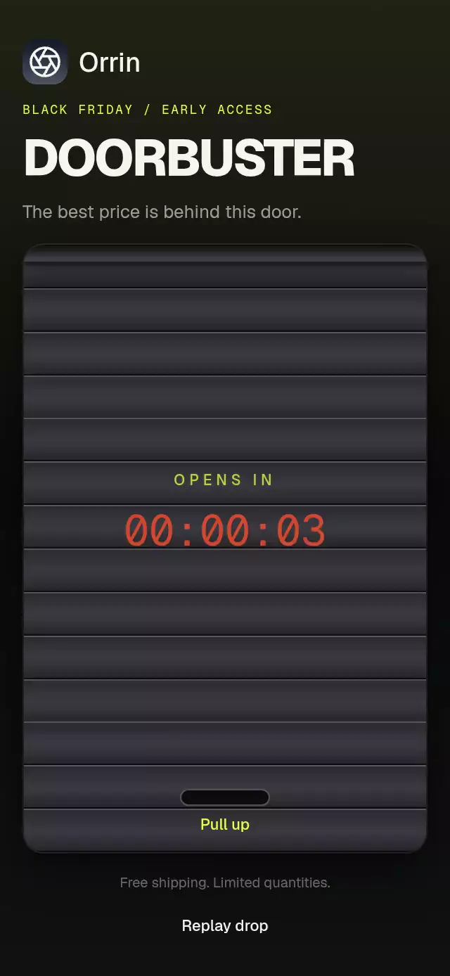
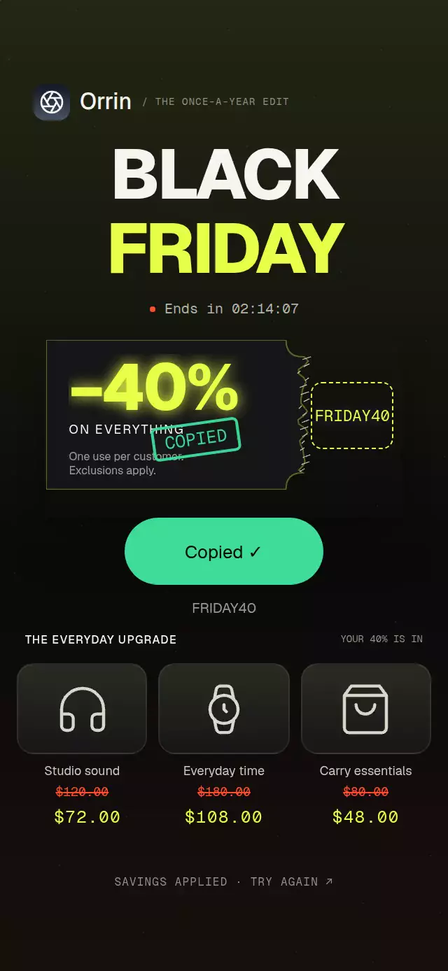
About this animation
A touch-origin circular theme reveal with configurable surface content, labels, palettes, and fonts.
How it works
onLayoutmeasures the component's own host. The origin is clamped to that rectangle; the radius reaches the farthest of its four corners.- A persistent interactive surface stays mounted. A second, noninteractive surface is composed at the same size before animation begins.
- One Reanimated progress value drives a circular native overflow wrapper and its opposite content offset. The content stays still as the crop grows; no screenshots, CSS masks, or content scaling are involved.
- Requests during a reveal reverse that same crop from its current radius, retaining its origin. An animation generation rejects stale completion callbacks.
- The persistent surface commits the final theme before the cover is removed on subsequent animation frames. Reduced motion replaces the iris with a 200 ms fade.
The radius animates layout properties on the UI runtime. Its real device layout cost and frame rate still need profiling; a successful bundle does not establish smoothness.
Install
Copy this folder without demo/ into your project. In an Expo project:
npx expo install react-native-reanimated react-native-workletsUse the Reanimated/Worklets setup appropriate to your project. The component uses React 19's ref prop and Reanimated 4's New Architecture runtime. The optional Lumen demo additionally uses Skia, Expo LinearGradient, and safe-area context; these are not dependencies of the reusable component.
Usage
import { useRef, useState } from 'react';
import { Pressable, Text, TextInput, View } from 'react-native';
import ThemeIrisReveal, { type ThemeIrisRevealHandle } from './theme-iris-reveal';

export function ReadingRoom() {
  const iris = useRef<ThemeIrisRevealHandle>(null);
  const [note, setNote] = useState('A quiet morning');
  return (
    <ThemeIrisReveal
      ref={iris}
      defaultTheme="light"
      labels={{ toggle: 'Appearance', light: 'Paper', dark: 'Night', transitioning: 'Changing appearance' }}
      renderSurface={({ palette, interactive }) => (
        <View style={{ flex: 1, backgroundColor: palette.background, padding: 24 }}>
          <TextInput
            value={note}
            onChangeText={interactive ? setNote : undefined}
            editable={interactive}
            focusable={interactive}
            accessibilityLabel="Daily note"
            style={{ color: palette.text, borderColor: palette.border, borderWidth: 1 }}
          />
          <Pressable disabled={!interactive} onPress={() => iris.current?.toggle()}>
            <Text style={{ color: palette.accent }}>Change appearance</Text>
          </Pressable>
        </View>
      )}
    />
  );
}
The host owns input values, selection, and scroll offset. Keep both renderings geometrically identical and synchronize any scroll positions. Honor interactive: false by disabling every visual-copy control and removing its tab stops. The wrapper also suppresses pointer events and hides the visual tree from assistive technology. Do not change the persistent surface's key with the theme: that would remount its inputs.
Controlled use with knobs:
<ThemeIrisReveal
  ref={iris}
  theme={theme}
  onThemeChange={setTheme}
  duration={600}
  motion={{ durationScale: 0.9, glowOpacity: 0.2 }}
  palette={{
    light: { accent: '#80541B', focus: '#80541B' },
    dark: { accent: '#F2C878', focus: '#F2C878' },
  }}
  renderSurface={renderSurface}
/>
reveal('dark', { x: 24, y: 180 }) uses points relative to this component. For a measured control center, subtract the host's measureInWindow origin from the control's center. For a touch, subtract that host origin from the touch's page coordinates; never pass screen coordinates directly. The demo demonstrates both paths. Keyboard activation uses the measured control center.
Props
| Prop | Default | Behavior |
|---|---|---|
renderSurface(context) | Required | Receives theme, full palette, interactive, and the three optional font families. |
theme | Uncontrolled | 'light' | 'dark'; authoritative destination. Ref methods only request it through onThemeChange. |
defaultTheme | Scheme fallback | Initializes uncontrolled state once. |
colorScheme | 'auto' | System fallback until locally changed; theme takes priority. Resolve auto in the host when using controlled mode. |
origin | Host center | Default {x,y} in local points; a method argument takes priority for an idle cycle. |
palette | Paper / Night | Flat Partial<Palette> overrides both themes; nested light / dark overrides take priority. |
labels | Generic English | Partial {toggle, light, dark, transitioning}; confirmed theme names are announced once. |
onThemeChange | — | Called once for each changed requested destination. Controlled parents may decline or delay requests; the prop is never forced. |
onRevealComplete | — | Called once for a finished reveal or completed reversal; canceled generations do not call it. |
duration | 520 | Clamped to 200–800 ms, then multiplied by durationScale. Reversal duration follows remaining progress distance. |
motion | {durationScale:1, glowOpacity:0.25} | Scale clamped to 0.5–2; rim intensity to 0–0.3. Reduced motion always uses 200 ms. |
fontFamily, titleFontFamily, monoFontFamily | System | Passed to the renderer; no catalog font dependency. |
disabled | false | Blocks pointer input and ref requests; renderer receives interactive:false. Reset remains available. |
style | — | Applied last to the flex host. Use {flex:0,width:300,height:400} for an embedded slot. |
testID | 'theme-iris-reveal' | Root; the visual cover has the -visual suffix. Surface control IDs belong to the host. |
accessibilityLabel | labels.toggle | Host description; child controls keep independent semantics. |
ref | — | ThemeIrisRevealHandle: reveal(theme, origin?), toggle(origin?), reset(). |
reset() silently cancels work and settles to the current controlled prop or the original uncontrolled theme. It invalidates pending completions. Resizing during an animation settles its destination and then measures the new host. If reduced motion becomes active during an iris, the component settles immediately rather than continuing the sweep. Unmount cancels the animation and accessibility subscription.
Nonfinite duration/intensity values use defaults; nonfinite origin coordinates use the corresponding host center. Out-of-bounds origins clamp to the host. Invalid method themes are ignored; invalid initial/controlled theme values fall back to the uncontrolled/system selection. No transition starts while the host is unmeasured. There is no list-data or asset input to validate.
The exported Palette includes background, surface, elevated, text, muted, border, accent, onAccent, accentSoft, glow, success, error, scrim, track, and focus. PAPER, NIGHT, measureIris, Theme, Origin, Labels, ThemePalette, and SurfaceContext are also exported.
Compatibility
Target stack: Expo SDK 58, React Native 0.88.0, React 19.2, Reanimated 4.7.1, Worklets 0.13.0. Intended for iOS, Android, web, and the matching Expo Go runtime. No native directories or extra modules are needed for the reusable component.
The demo uses only local code-generated material: raster resolution, download size, and image loading gates are N/A. It uses catalog-provided OFL fonts only in demo/.
The component adds no safe area and no scrolling: its host owns insets and scroll. The demo consumes the host safe-area context once, using the larger of its design padding and each vertical inset. It uses one outer scroll container with hidden indicators for short windows and large text; normal phone sizes fit without an interior scroll region. There is no capture of the rendered surface, so uncontrolled external widgets, focus visuals, and asynchronous media must be mirrored by the host if they must look identical in both copies.
Accessibility
The interactive tree remains mounted through theme changes to preserve native input focus. Visual copies are pointer-inert and hidden with accessibilityElementsHidden, importantForAccessibility, and aria-hidden; the renderer must disable their keyboard stops as shown above. Reduced motion uses a 200 ms fade and suppresses the rim. One announcement occurs on completion, never per frame. Supply localized labels and host semantics. The demo exposes selected theme buttons and checked switches, plus native keyboard activation and visible focus borders. It mirrors row direction for RTL. No drag gesture or arrow-key grid is involved.
Why this one
A theme switch changes the entire reading room from the point of contact, including ink and fine borders. Editorial serif summaries and monospaced reading time give Paper and Night their own material identity while keeping the same geometry. Interruption contracts, controlled mode, host-owned inputs, and farthest-corner coverage make the effect useful beyond a fixed full-screen demonstration.
Icons: Lucide (ISC), copied exactly from the repository kit. Lumen is the repository's fictional demo brand. No third-party reference artwork, text, or source code is included.