About this animation
An interval timer with rolling countdowns and work-to-rest transitions, with configurable work duration, exercises, work color, and fonts.
Why this one
Ordinary interval timers replace a number and jump between colors. This timer rolls only the changing columns, sweeps the arc back in over 400 ms, blends the phase color through the ring and radial light, and moves the exercise through a soft blur. The last three seconds pulse; the play/pause silhouette morphs from sampled Lucide contours. Finishing brings a full rotation, a two-color ring, and fine particles.
How it works
- One
useFrameCallbackadvances elapsed session time on the UI thread. Pausing freezes that time rather than restarting an animation. - Derived values calculate the round, phase, remaining seconds, and normalized arc endpoint. The clock uses elapsed milliseconds, not frame counts.
- Countdown columns roll during the final 180 ms of a second, only when their digit changes. Each column has a fixed width and fades digits by distance.
- Phase changes drive a 400 ms refill and color blend. Exercise text starts its transition in
useLayoutEffectafter the new label commits. - Press feedback uses a separate interruptible spring. Completion stops the clock and drives a single celebration.
- Screen-reader announcements and consumer callbacks run on JS via
scheduleOnRN, only at phase boundaries.
Install
npx expo install @shopify/react-native-skia expo-blur react-native-reanimated react-native-workletsCopy this folder without demo/. Configure Reanimated for your Expo application. On web, load CanvasKit before importing this component (for example using Skia's WithSkiaWeb wrapper and a lazy import). This component must not be eagerly evaluated before CanvasKit loads.
Icons: Lucide (ISC), copied from the repository kit. No external images or fonts are required. For the demo, load the repository's Geist, Geist Mono, and Instrument Serif fonts once at app startup.
Usage
import { WorkoutTimerRing } from './workout-timer-ring';

export function Workout() {
  return <WorkoutTimerRing exercises={['Squats', 'Plank taps']} />;
}
import { useRef } from 'react';
import { WorkoutTimerRing, type WorkoutTimerRingRef } from './workout-timer-ring';
export function CustomWorkout() {
const timer = useRef<WorkoutTimerRingRef>(null);
return (
<WorkoutTimerRing
ref={timer}
workSeconds={30}
restSeconds={15}
rounds={6}
sessionLabel="Circuit"
exercises={['Reverse lunges', 'Mountain climbers']}
workColor="#FB923C"
restColor="#5EEAD4"
onPhaseChange={(phase, round) => reportPhase(phase, round)}
/>
);
}Replace reportPhase with your callback. The component initially pauses; call timer.current?.play() from an event or effect to begin. reset(round, remaining) starts a fresh session at the chosen work phase. reset() starts at round 1. next() advances one phase; restartPhase() restarts the current phase; pause() freezes; play() resumes. After completion, the main button starts another session.
Props
| Prop | Type | Default | Description |
|---|---|---|---|
labels | Partial<WorkoutTimerRingLabels> | American English defaults | round: Round; of: of; work: WORK; rest: REST; finished: FINISHED. Phase names also apply to the duration summary. Omitted keys retain their defaults. |
| workSeconds | number | 20 | Work duration, clamped to 1–3599 seconds. |
| restSeconds | number | 10 | Rest duration, clamped to 1–3599 seconds. |
| rounds | number | 8 | Whole rounds, minimum 1. Set session configuration before starting. |
| exercises | readonly string[] | ['Exercise'] | Names repeat to fill the session; an empty list falls back to Exercise. |
| header | ReactNode | — | Optional product or brand header. |
| sessionLabel | string | Intervals | Session name in the round counter. |
| workColor | string | #F97316 | Work ring, label, and light color. |
| restColor | string | #2DD4BF | Rest ring, label, and light color. |
| backgroundColor | string | #050A0A | Background and radial light edge. |
| fontFamily | string | system | UI text family. |
| monoFontFamily | string | system | Tabular countdown family. |
| serifFontFamily | string | system | Exercise family. |
| onPhaseChange | (phase, round) => void | — | Work/rest/complete callback with one-based round. |
| style | StyleProp<ViewStyle> | — | Root container overrides. Provide a bounded height. |
| testID | string | — | Root test identifier. |
duration | number | 400 | Exercise phase color transition duration in milliseconds; workSeconds and restSeconds are separate. Spring physics and reduced-motion timing are unchanged. |
workSeconds | number | 20 | Work phase duration in seconds. |
restSeconds | number | 10 | Rest phase duration in seconds. |
rounds | number | 8 | Number of rounds. |
exercises | readonly string[] | DEFAULT_EXERCISES | Exercise names, repeated when fewer than rounds. |
header | ReactNode | undefined | Header content, such as a brand tile. |
sessionLabel | string | 'Intervals' | Session label. |
workColor | string | '#F97316' | Work color. |
restColor | string | '#2DD4BF' | Rest color. |
backgroundColor | string | '#050A0A' | Background color. |
fontFamily | string | undefined | UI font family. |
monoFontFamily | string | undefined | Countdown font family. |
serifFontFamily | string | undefined | Exercise font family. |
onPhaseChange | ( phase: 'work' | 'rest' | 'complete', round: number, ) => void | undefined | Callback on phase changes, including completion. |
style | StyleProp<ViewStyle> | undefined | Container style. |
testID | string | undefined | Test identifier. |
Compatibility
Targets Expo SDK 58, React Native 0.88.0, Reanimated 4.7.1, worklets 0.13.0, Skia 2.14.0, and expo-blur 58.0.5.
Android blur uses a BlurTargetView and dimezisBlurViewSdk31Plus, following the Expo SDK 58 BlurView documentation. The dark translucent card provides its surface treatment on platforms without real blur.
Accessibility
All controls have button roles and action labels; side controls are 48 pt and the main button is 76 pt. Touching the ring pauses or resumes. The countdown is hidden from the accessibility tree to prevent repeated digit announcements. Each phase announces its name and duration, and completion is announced once. Reduced motion keeps color fades and removes digit travel, pulse, exercise travel/blur, button morph travel, rotation, and particles.
Demo
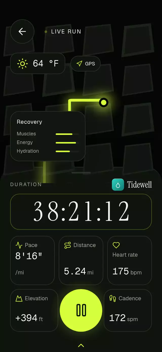
The Tidewell demo starts at round 3 with 14 seconds left. Autoplay starts with 2 seconds left and resets every 6.5 seconds, putting the coordinated rest transition within the first three seconds. Full-session timing is still 8 × (20 + 10) = 4:00.
Layout is derived from onLayout: header at 0.06 H, 0.78 W ring centered at 0.38 H, card at 0.66 H, and controls at 0.80 H. At 320×694 the card ends around 546 pt and the controls begin around 555 pt; at 390×844 they have more separation. Header content stays left of the viewer's upper-right close button. Light is a radial shader and blur belongs to the text/material; no opaque effect block sits above content.