About this animation
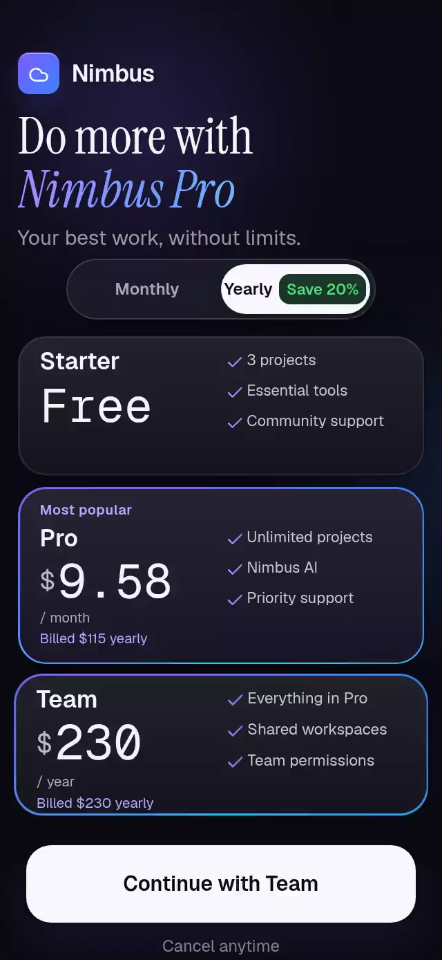
A pricing selector with rolling prices and expanding disclosures, with configurable plans, labels, accent color, and fonts.
Why this one
Only changing price columns roll. Unchanged digits stay still, decimal places expand into the layout, annual billing reveals with height and opacity, and the savings badge celebrates the annual switch. The recommendation border is a real gradient stroke; the demo headline applies its gradient inside the glyphs.
How it works
- A single
billingshared value drives the thumb, every price column, units, and disclosure lines. - Tap and horizontal pan use Gesture Handler exclusively. Release projects velocity and settles with an interruptible spring.
- Whole digits align at the decimal boundary. Each changed column moves its two glyphs one line apart and fades by distance; at rest exactly one glyph is visible.
- A separate selection value drives card scale. Selection borders fade over 200 ms, while the recommended border stays on.
- Skia draws one conic border and all three Lucide checks per card. One border revolution takes eight seconds.
- Pressure uses independent shared values, preventing native release events from canceling billing or selection.
Install
npx expo install @shopify/react-native-skia expo-blur expo-linear-gradient react-native-gesture-handler react-native-reanimated react-native-workletsSet up Reanimated and a GestureHandlerRootView in the host app. On web, load CanvasKit before mounting this component (for example, Skia's WithSkiaWeb); the catalog must register this demo with its existing withSkia loader. No packages or native configuration were changed for this piece.
Usage
import PricingTogglePlans from './pricing-toggle-plans';

<PricingTogglePlans onContinue={(plan, billing) => openCheckout(plan, billing)} />;
const pricing = useRef<PricingTogglePlansRef>(null);
<PricingTogglePlans
ref={pricing}
plans={myPlans}
initialPlan="pro"
header={<MyProductHeader />}
accentColor="#7C5CFF"
springDamping={26}
springStiffness={300}
borderDuration={8000}
fontFamily="MyInterfaceFont"
mediumFontFamily="MyMediumFont"
monoFontFamily="MyMonoFont"
/>;
pricing.current?.setBilling('yearly');
pricing.current?.selectPlan('team');
pricing.current?.reset();The host supplies loaded fonts. The component falls back to platform text fonts. The Nimbus demo uses Geist, Geist Mono, and Instrument Serif, plus local font assets for Skia's headline.
Props
| Prop | Type | Default | Purpose |
|---|---|---|---|
plans | readonly PricingPlan[] | Basic / Plus / Group | Three plans with monthly and annual display prices, three benefits, disclosure, recommendation, and action labels |
initialPlan | string | Recommended plan | Initially selected identifier |
header | ReactNode | Generic heading | Brand and headline content |
fontFamily | string | System | Interface typeface |
mediumFontFamily | string | System | Headings and buttons |
monoFontFamily | string | System | Tabular price typeface |
accentColor | string | #7C5CFF | Border and environmental accent |
backgroundColor | string | #0B0B12 | Screen background |
springDamping | number | 56 | Billing and selection damping. Values below the damping needed for ζ ≥ 0.8 are raised to that minimum. |
springStiffness | number | 300 | Billing and selection stiffness |
borderDuration | number | 8000 | Revolution duration in milliseconds |
savingsLabel | string | Save 20% | Annual savings badge |
recommendedLabel | string | Most popular | Recommendation badge |
footerLabel | string | Cancel anytime | Reassurance copy |
accessibilityLabel | string | Yearly billing | Switch label |
onBillingChange | (period) => void | — | Billing selection callback |
onPlanChange | (id) => void | — | Plan selection callback |
onContinue | (id, period) => void | — | Checkout callback |
style | StyleProp<ViewStyle> | — | Root overrides |
testID | string | — | Root identifier |
PricingPlan provides id, name, monthly, yearly, features, optional yearlyUnit, yearlyBill, recommended, and actionLabel. Prices exclude $; Free denotes a free plan. Annual prices can represent a monthly equivalent or an annual total, with the appropriate unit and disclosure. Keep benefits short enough for the side column.
Demo timing and layout
The demo switches to annual at 850 ms and selects Team at 2700 ms, repeating every 4800 ms. The first transition is the wow moment. The header begins at 5.5% of container height, switch at 27%, cards at 35%, and action at 88%. Card heights are 14.5% / 18.5% / 14.5%, with 8-point gaps. Cards occupy 92% of container width; the switch occupies 70%. The action is 56 points tall. Intended portrait sizes: 390×844 and 320×694; longer localized content or a larger text scale requires a host scroll container and more height.
Compatibility
Expo SDK 58, React Native 0.88.0, Reanimated 4.7.1, worklets 0.13.0, and Skia 2.14.0. Uses installed Expo Go modules. Android blur targets the environmental backdrop with BlurTargetView; Android below API 31 uses the supported translucent fallback.
Accessibility
The billing control exposes a switch role, checked state, value, and an activate action. Plans expose radio roles and checked states with names, prices, and benefits. The action has a button role and reflects the selected plan. Touch targets are at least 44 points at the intended sizes. Reduced motion replaces rolling with fades, removes pressure and selection scaling, freezes the border and ambient drift, and disables the savings bounce. Screen readers do not traverse decorative canvases as controls.
Icons: Lucide (ISC). Demo identity: Nimbus from the project kit. No external images or reference branding.
Spring damping floors use Reanimated 4.7.1’s default mass of 4 when the configuration does not set a mass. Stiffness and mass remain unchanged.