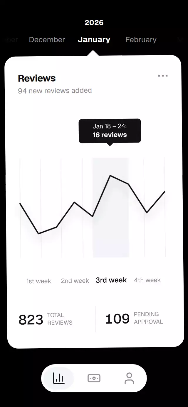
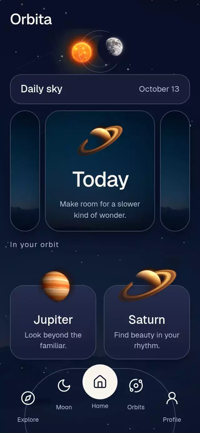
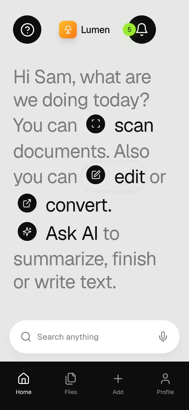
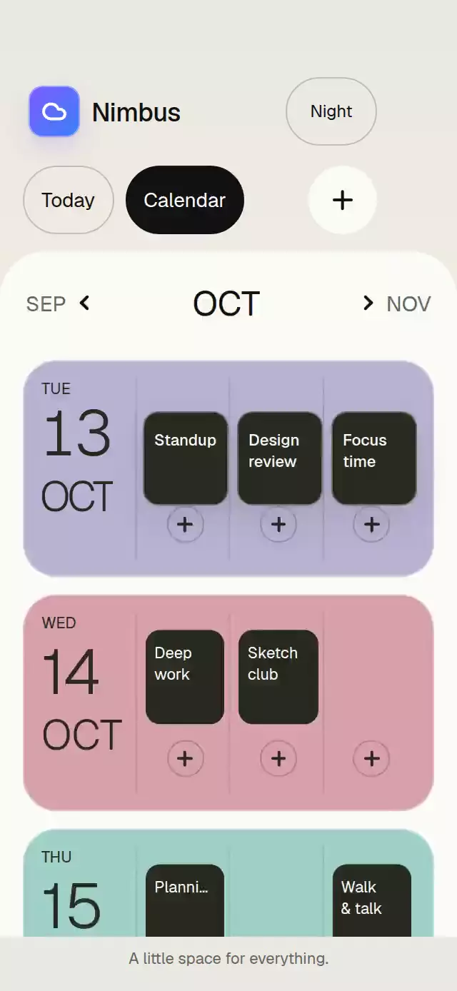
About this animation
A flight status pill that springs into a boarding card, with configurable flight labels, compact width, gradient colors, and fonts.
Why this one
Most status pills stop at a size morph. This version connects the morph to a complete boarding flow: a continuous drag, a staged content handoff that never crushes labels, live group progress, an automatic priority expansion, and a restrained gradient edge glow when the traveler's group is called.
How it works
- The component measures its own container and derives the expanded width from that local measurement.
- One continuous
progressshared value drives width, height, corner radius, and every expanded-content reveal. A short transition phase clears the old labels before the shape moves, then admits the new state after the morph passes 70%. - A vertical pan writes directly to the same progress, so a drag can interrupt a spring at any point and release with its gesture velocity.
- Live stages animate the five-part boarding bar independently, pulse the active group, and trigger a short edge glow when Group 3 is called.
- The forwarded ref lets an app synchronize expansion and live state changes with push events or an autoplay demo.
Install
npx expo install @shopify/react-native-skia expo-linear-gradient react-native-gesture-handler react-native-reanimated react-native-workletsIcons: Lucide (ISC).
Usage
import LiveActivityPill from './LiveActivityPill';

export function FlightScreen() {
  return <LiveActivityPill onBoardingPassPress={() => openPass()} />;
}
Customize the content, brand, and live state:
import { useRef } from 'react';
import LiveActivityPill, { type LiveActivityPillRef } from './LiveActivityPill';

export function FlightScreen() {
  const activityRef = useRef<LiveActivityPillRef>(null);

  return (
    <LiveActivityPill
      ref={activityRef}
      flightLabel="AX 408"
      gateLabel="Gate C8"
      compactLabel="Boarding 8:20"
      userGroupLabel="Group 4"
      brandColors={['#8B5CF6', '#4338CA']}
      expandedWidthRatio={0.9}
      onExpandedChange={(expanded) => trackExpansion(expanded)}
    />
  );
}
The ref exposes expand(), collapse(), toggle(), and setStage(stage).
Props
| Prop | Type | Default | Description |
|---|---|---|---|
flightLabel | string | 'Flight 214' | Short identifier shown in the expanded header. |
gateLabel | string | 'Gate B12' | Gate label shown opposite the flight identifier. |
compactLabel | string | 'Boarding 7:05' | Compact status label. |
userGroupLabel | string | 'Group 3' | Label for the user's boarding group. |
initialStage | LiveActivityStage | 'upcoming' | Initial live status. |
initiallyExpanded | boolean | false | Initial expansion state. |
compactWidth | number | 126 | Compact width in points. |
compactHeight | number | 36 | Compact height in points. |
expandedHeight | number | 172 | Expanded height in points. |
expandedWidthRatio | number | 0.94 | Expanded width as a fraction of the container. |
brandColors | readonly [string, string] | ['#0EA5E9', '#1E3A8A'] | Brand gradient used for the tile and live glow. |
fontFamily | string | undefined | Font for interface labels. |
mediumFontFamily | string | undefined | Medium font for emphasized labels. |
monoFontFamily | string | undefined | Monospace font for changing status text. |
onExpandedChange | (expanded: boolean) => void | undefined | Called when expansion settles across the halfway point. |
onBoardingPassPress | () => void | undefined | Called when the boarding-pass action is pressed. |
accessibilityLabel | string | 'Flight activity' | Screen-reader label for the pill. |
style | StyleProp<ViewStyle> | undefined | Style for the full-screen overlay container. |
testID | string | undefined | Test identifier applied to the overlay container. |
duration | number | 620 | Success glow settling duration in milliseconds. Spring physics and reduced-motion timing are unchanged. |
Compatibility
- Expo SDK 58
- React Native 0.88
- Reanimated 4.7 and Worklets 0.13
- Skia 2.14
- iOS: supported
- Android: supported
- Web: supported
- Works in Expo Go because every native dependency is bundled with Expo SDK 58
Accessibility
The pill and boarding-pass control expose button roles and descriptive labels. Tapping toggles the same state as the vertical gesture, and the full background is a collapse target. With reduced motion enabled, shape changes settle immediately, decorative pulses and bounce are removed, and state content remains readable without motion.