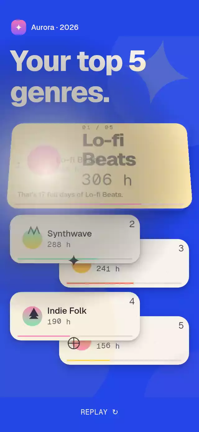
About this animation
A reverse-ranking reveal with flipping cards and a final spotlight, with configurable ranked items, colors, timing, and fonts.
Why this one
The countdown creates anticipation instead of showing a static list. Number one gets its own scene: a butter-colored card, an enlarged initials avatar, an orbit of eight four-point stars, and rolling digits. The other cards make room with a damped, interruptible spring.
How it works
- Measure the assigned container with
onLayout; no window dimensions or safe-area assumptions. - Drive the reveal from one UI-thread timeline: ranks 5–2 start 280 ms apart, each flipping over 420 ms with cubic ease-out.
- Hold a 700 ms suspense phase, then flip rank 1 and spring the list into its spotlight layout. The default reveal finishes in 2.38 seconds.
- Render the star crown in one Skia canvas. A separate ambient clock rotates it; the reveal timeline controls its launch. Numeric detail prefixes roll without React state updates per frame.
replay()stores a static timeline snapshot and uses an extra timeline segment for the face-down sweep: 140 ms per card, starts 60 ms apart. This also works partway through a reveal.- Revealed rows support native press and keyboard activation. Selection has its own press spring and calls
onSelect.
Install
npx expo install @shopify/react-native-skia expo-linear-gradient react-native-reanimated react-native-workletsUse the versions compatible with your Expo SDK. For web, configure CanvasKit using the Skia setup required by your app and initialize it before loading this module. No images or fonts ship with the component.
Usage
import { useRef } from 'react';
import { TopFiveCountdown, type TopFiveCountdownRef } from './top-five-countdown';

const ranking = [
  { id: 'a', name: 'Reading', detail: '82 hours', initials: 'R' },
  { id: 'b', name: 'Walking', detail: '64 hours', initials: 'W' },
  { id: 'c', name: 'Cooking', detail: '51 hours', initials: 'C' },
  { id: 'd', name: 'Drawing', detail: '36 hours', initials: 'D' },
  { id: 'e', name: 'Gardening', detail: '24 hours', initials: 'G' },
] as const;

function Review() {
  const countdown = useRef<TopFiveCountdownRef>(null);
  return (
    <TopFiveCountdown
      ref={countdown}
      items={ranking}
      title={'Your top 5\nthis year.'}
      style={{ flex: 1 }}
    />
  );
}
Personality controls:
<TopFiveCountdown
  items={ranking}
  autoplay={false}
  colors={{ background: '#101028', onBackground: '#F7F3EA', winner: '#7CE8B8' }}
  timings={{ flip: 420, stagger: 280, suspense: 700 }}
  fonts={{ heavy: 'YourDisplayFont', medium: 'YourTextFont', mono: 'YourMonoFont' }}
  onSelect={(item) => openDetails(item.id)}
  onRevealComplete={() => enableNextStory()}
/>
Call ref.current?.play() to start, or ref.current?.replay() to sweep and restart. play() is idempotent while running or complete. Calls to replay() during a sweep are ignored. The demo waits 2.5 seconds after completion before replaying when autoplay is enabled.
Props
| Prop | Type | Default | Description |
|---|---|---|---|
items | readonly tuple of five TopFiveItem | required | Rank 1 first. Each item has id, name, detail, initials, and optional two-color colors. |
numberOneCaption | string or (item) => string | Hours converted to full days | Context under the winner. |
suspenseTitle | string | And your\n#1 is… | Newline-separated suspense copy. |
title | string | Your top 5\nthis year. | Explicit newline separates poster lines. |
colors | Partial<TopFiveColors> | collection palette | All page, card, text, stripe, glow, avatar and shadow tokens. |
timings | Partial<TopFiveTimings> | see below | Durations in milliseconds; use nonnegative values. |
autoplay | boolean | true | Start once after the container is measured. |
fonts | { heavy?, medium?, mono? } | system fonts | Pass loaded font-family names; demo uses Geist Heavy, Medium and Mono. |
onSelect | (item) => void | — | Called only for revealed cards. |
onRevealComplete | () => void | — | Once per completed reveal. |
announcement | (item) => string | Your number one is … | Localize the final screen-reader announcement. |
unrevealedLabel | (rank) => string | Rank …, unrevealed | Localize face-down row labels. |
style | StyleProp<ViewStyle> | — | Root container override. |
testID | string | top-five-countdown | Row suffixes are -row-1 through -row-5. |
Default timing tokens: flip: 420, stagger: 280, suspense: 700, titleLine: 260, titleStagger: 240, reset: 140, resetStagger: 60, orbit: 24000. Titles rise 8 points with cubic ease-out. Numeric detail prefixes support up to seven unsigned digits; other strings render unchanged.
Default palette: background #2346E8, paper #F7F3EA, ink #101028, muted #555365, onBackground #F7F3EA, winner/glow #FFD84D, stripe #DCD8CF, avatarStart #FF8AC6, avatarEnd #FF6B4A, avatarInk/shadow #101028. Use hex colors for shadow because the component appends alpha values.
Layout
The component fills its parent and limits the poster width to 520 points. The winner becomes a butter-yellow scene at 36% of the assigned height (minimum 148 points), with a 24%-width avatar, an orbiting eight-star crown and a contextual caption. The remaining entries spring into a two-column grid with proportional listening bars and distinct genre artwork. Background shapes, grain, genre marks and the crown share one Canvas. The host owns safe-area insets. Give it at least 300×390 points with the default two-line title. Compact boxes preserve 48-point touch targets; two columns keep the complete ranking visible even at 300×400. The demo hides its optional branding and replay control below 500 points tall. For exceptionally long titles, larger accessibility fonts, or smaller containers, supply more height in a host scroll layout.
Accessibility
The ranking exposes list and listitem roles and labeled buttons. Face-down cards expose only their rank and are disabled until revealed. Selected cards announce their selected state. Completion announces the winner using the customizable formatter. Reduced motion uses 200 ms fades: no flips, shake, animated growth, flying stars, or orbit; numeric details appear directly. The final grid switches into place behind the reveal fade. Text scaling stays enabled.
Compatibility
Targets Expo SDK 58, React Native 0.88.0, Reanimated 4.7.1, Worklets 0.13.0, Skia 2.14.0, and Expo Linear Gradient 58.0.3. Uses modules bundled with the project's Expo Go SDK. Supports iOS, Android, and web.
Winner scene customization
numberOneCaption accepts a string or (item) => string. By default, numeric hours become full days, for example “That's 17 full days of Lo-fi Beats.” suspenseTitle accepts newline-separated suspense lines (default And your\n#1 is…). Both additions are optional; existing props and imperative methods are unchanged.
Each reveal fills its listening bar and rolls its detail using one animated strip per decimal place. Integer counting keeps every strip precisely aligned at rest. Suspense dims the surrounding page by 30%, isolates the winner, and uses deterministic stepped noise. The reveal flash uses a radial gradient with a transparent edge.