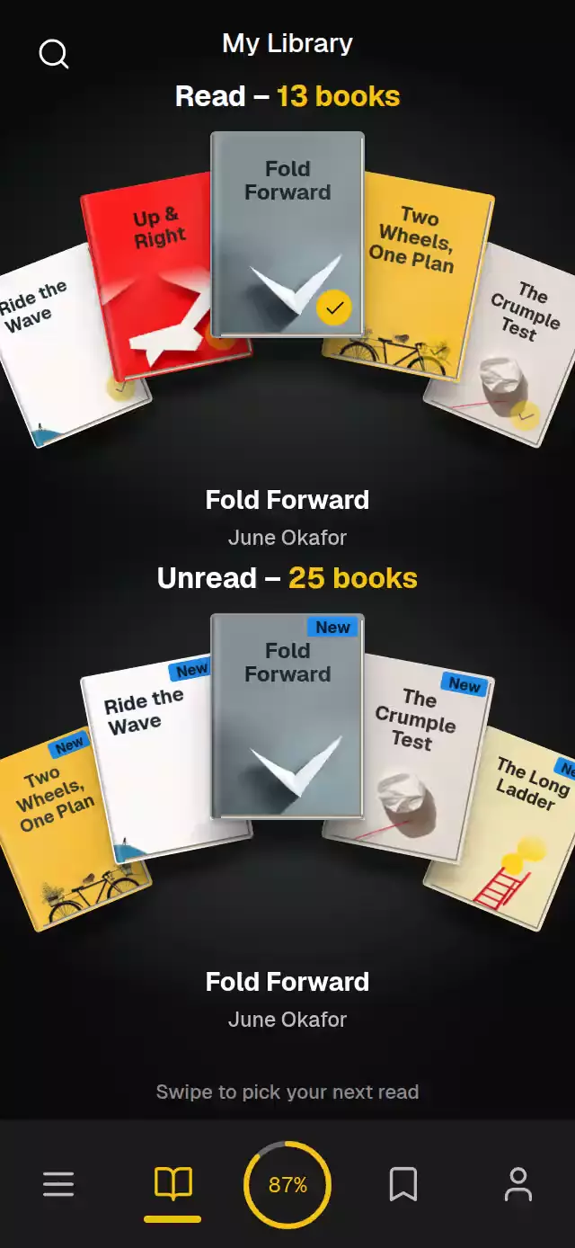
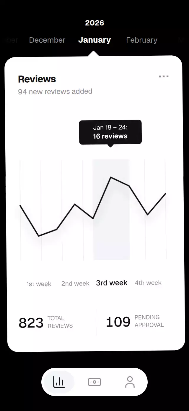
About this animation
A music carousel with a rotating semicircular dial and configurable mixes, labels, colors, and font.
Why this one
The arc, circular artwork, and calibrated dial all respond to one continuous index. This gives a music carousel a clear physical identity and makes a swipe feel like moving through a record collection.
How it works
- Track the carousel with one continuous shared index.
- Derive record positions along the arc, artwork scale, and dial rotation from that index.
- Use pan release and skip controls to move to a centered record with interruptible motion.
- Rotate the active record during playback; reduced motion disables rotation and the edge sparkle.
Install
Copy the files listed in piece.json into your project. Install SDK-compatible dependencies:
npx expo install @shopify/react-native-skia expo-image expo-linear-gradient react-native-gesture-handler react-native-reanimated react-native-workletsMount below a GestureHandlerRootView and load host fonts before rendering. Initialize CanvasKit before mounting Skia on web.
Usage
import VinylDialCarousel from './VinylDialCarousel';

<VinylDialCarousel
  mixes={[
    {
      id: 'daily-mix',
      cover: require('./assets/cover.webp'),
      kicker: 'DAILY MIX',
      titleTop: 'ENDLESS',
      titleBottom: 'VIBES',
    },
  ]}
/>
Pass at least three mixes for a full arc. Each mix needs a stable id, an image cover, and the three title strings. backdrop optionally supplies the blurred full-screen image. The component exposes next(), previous(), goTo(index), and togglePlay() through its ref.
Props
| Prop | Type | Description |
|---|---|---|
mixes | VinylMix[] | Artwork and title content for each mix. |
initialIndex | number | Initially centered item. |
labels | Partial<VinylDialLabels> | Header and accessibility labels. |
colors | Partial<VinylDialColors> | Background, foreground, accent, and glass colors. |
fontFamily | string | Font family for the fixed interface labels. |
onChange | (index: number) => void | Called when the centered mix changes. |
onPlayToggle | (playing: boolean) => void | Called when playback toggles. |
onSearch / onSave | () => void | Bottom actions. |
style | StyleProp<ViewStyle> | Optional root style. |
Compatibility
- Expo SDK 58 and React Native 0.88
- iOS, Android, and web
- Uses
expo-image, Gesture Handler, Reanimated, Worklets, and Skia
Accessibility
Records and controls expose button roles and labels. Reduced motion disables continuous rotation and the active edge sparkle; the carousel still supports direct record taps and skip controls.