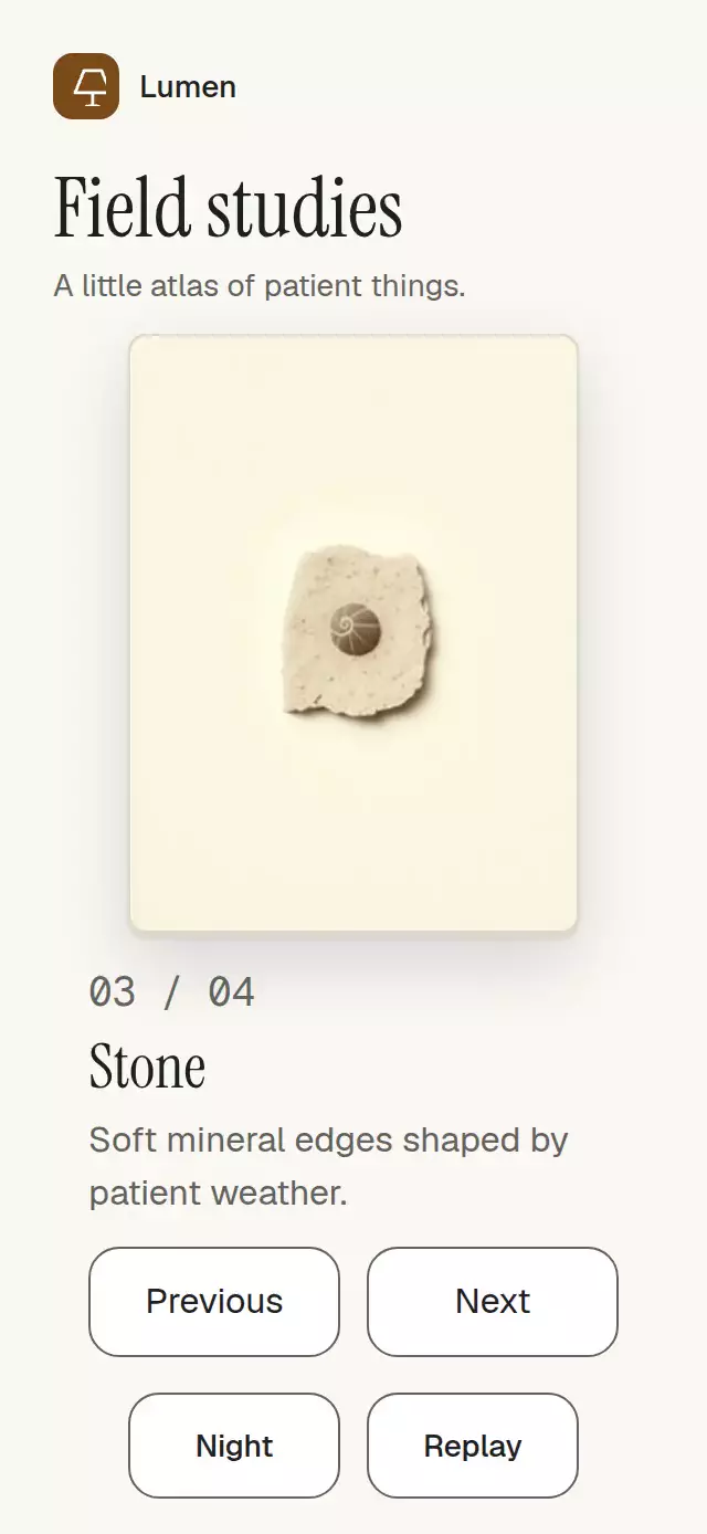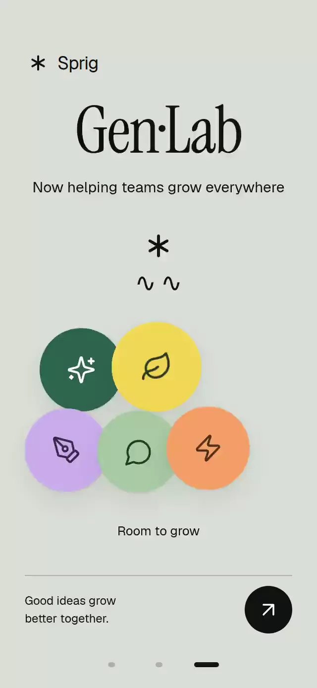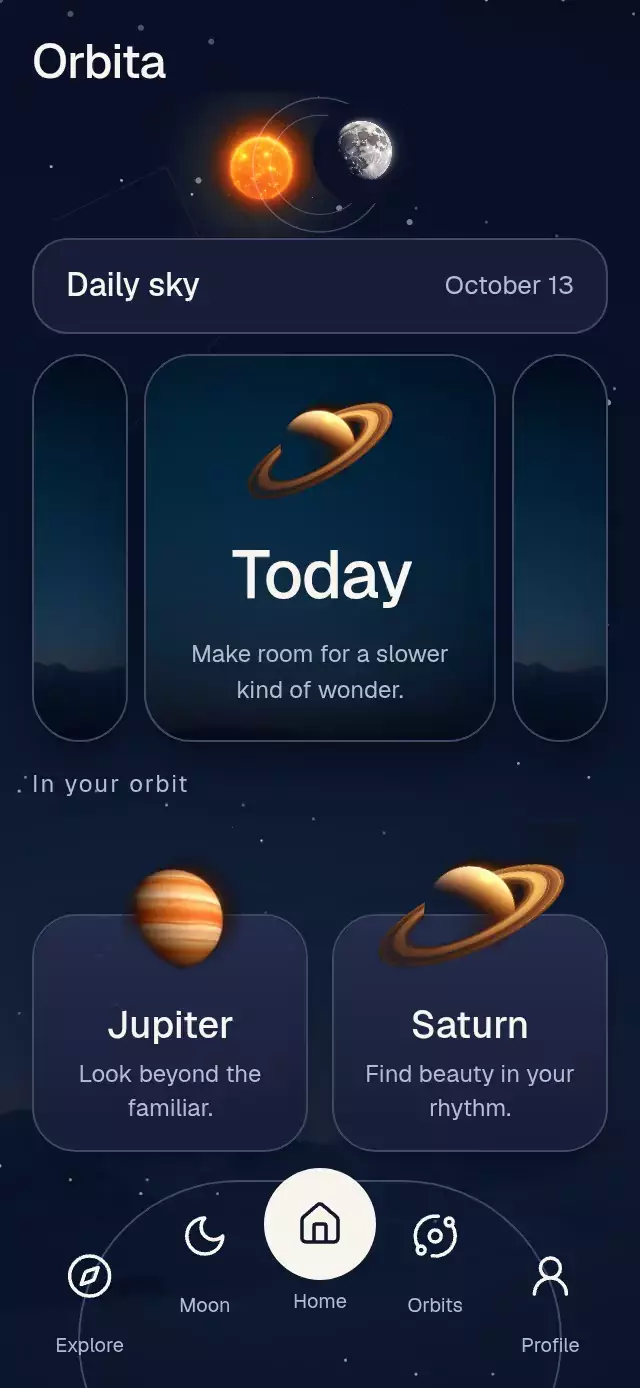
About this animation
A circular selector with animated elemental materials and configurable elements, colors, labels, and fonts.
How it works
- One continuous Reanimated index drives the circular track, capsule scale, and atmosphere. A pan projects its release velocity into the nearest detent; selection uses a spring with explicit mass.
- Each capsule owns independent fill and effect progress. Outgoing flames dissolve into rising embers over 650 ms while the whole material fades between 150 and 400 ms; movement starts at 100 ms, color rises at 300 ms, and the incoming light grows at 450 ms. Interruptions start from the current values.
- A single bounded Skia scene draws retained capsule geometry, Lucide icons, the floor, and inexpensive gradient reflections. Only the current and retiring effects are rendered. No animated blur filters or full-screen shaders are used.
- Fire uses a capsule distance field, six to nine independent noise-driven tongues, and seeded sparks. Rays follow the capsule contour with a white rim and gold halo; wind uses 32–44 open streamlines from a potential-flow approximation. Nine retained petal paths carry fine veins, open with a staggered spring envelope, and breathe gently. Four diffuse color patches drift inside each capsule over 8–12 seconds.
- The host owns autoplay. Touch immediately calls
onInteractionStart; the demo cancels its remaining cues.
The initial capsule starts filled, with its effect already visible and growing into place. Positive modulo in ring.ts keeps effect targets, selection, colors, and reflections consistent through either ring seam. An effect stays mounted while it is active or still fading out; no retirement timer can hide the active effect. Pending exit animations are canceled before a capsule reenters.
Install
npx expo install @shopify/react-native-skia react-native-reanimated react-native-worklets react-native-gesture-handlerPlace your app inside GestureHandlerRootView. Configure Reanimated/Worklets for your Expo SDK. For web, load CanvasKit before importing this module, using Skia's LoadSkiaWeb and a lazy import. Copy all files listed in piece.json; demo/ is optional.
Usage
import { useRef } from 'react';
import ElementalCapsuleCarousel, {
  type ElementalCapsuleCarouselHandle,
} from './elemental-capsule-carousel';

function Selector() {
  const carousel = useRef<ElementalCapsuleCarouselHandle>(null);
  return (
    <ElementalCapsuleCarousel
      ref={carousel}
      onSelect={(id) => saveElement(id)}
      style={{ flex: 1 }}
    />
  );
}
Use controlled selection and a compact host:
<ElementalCapsuleCarousel
  elements={myElements}
  index={selectedIndex}
  onIndexChange={setSelectedIndex}
  colors={{ background: '#090406', text: '#FFFFFF' }}
  motion="system"
  fxQuality="low"
  showReflection={false}
  style={{ width: 300, height: 400, flex: 0 }}
/>
Supply four unique IDs, at least two gradient stops, and short names/taglines. next(), prev(), and goTo(i) wrap continuously. In controlled mode a request calls the callbacks; the parent commits it by updating index. Keep element IDs and ordering stable during an interaction.
Props
| Prop | Default | Purpose |
|---|---|---|
elements | Four generic elements | IDs, numbers, Lucide icon names, titles, taglines, gradients, glow colors, effect kinds, and optional spoken labels |
initialIndex | 0 | Initial selection |
index, onIndexChange | Uncontrolled | Optional controlled selection and request callback |
onSelect | — | Selected stable ID |
onInteractionStart | — | Host autoplay cancellation |
labels | English structural copy | Root description, selected suffix, and accessibility hint |
colorScheme | dark | dark, light, or auto |
colors | Theme palette | Background, glass, border, text, secondary, activeText |
fontFamily, titleFontFamily, monoFontFamily | System | Host-loaded typefaces |
motion | system | system, full, or reduced |
fxQuality | Low on web, high on native | Tongue, spark, and streamline density; the same effect on all platforms |
showReflection | true | Material and lotus reflection |
bottomInset | 0 | Space reserved by a full-screen host |
autoplay | — | Host intent; does not start internal timers |
accessibilityLabel | labels.carousel | Root spoken description |
style, testID | Flexible root, elemental-capsule-carousel | Container layout and test prefix |
ref | — | ElementalCapsuleCarouselHandle |
Compatibility
Designed for Expo SDK 58, React 19.2, React Native 0.88, Reanimated 4.7, Worklets 0.13, Gesture Handler 3.3, and Skia 2.14. Supports iOS, Android, Expo Go, and web with CanvasKit. Layout follows the container; portrait displays three whole capsules, while wide/tablet layouts recompose into four. The component applies no system insets; pass the host's actual bottom inset for full-screen use.
Accessibility
Every capsule is a labeled button with selected state and a touch alternative to the pan. All copy comes from data/labels. The root and each capsule have stable test IDs; -active identifies the selected title and -fx identifies the scene. Reduced motion freezes ambient effects, removes sparks, and fades the track out and back in over 220 ms while changing its pose without travel. Material and light crossfade over the same interval. Text follows system scaling; keep custom descriptors concise.
Why this one
The interaction and atmosphere share a continuous index, so the light follows the finger. Retained paths and bounded procedural effects keep the rendering independent of React's frame rate. Reflection adds depth without rerendering a second flame or wind simulation.
Icons: Lucide (ISC). All other geometry and shader code are original. Demo typefaces: Geist and Geist Mono (OFL), supplied by the host.