About this animation
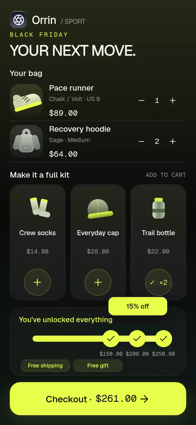
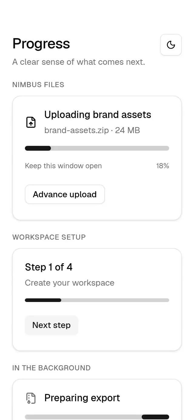
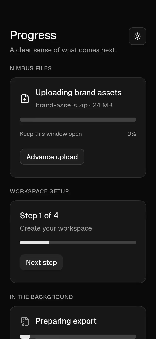
A four-step checkout with animated progress and configurable cart items, shipping options, gradient colors, and fonts.
Why this one
Most checkout steppers only swap screens and recolor dots. This version uses one continuous value for the connector fill, number-to-check morph, active ring, content direction, blur, stagger, and adaptive card height. A persistent order strip keeps the cart visible, paid shipping rolls into every total, and the final action compresses into a focused progress state before an expanding confirmation ring and fine particles celebrate success.
How it works
- A single Reanimated shared value moves continuously from
0through3. - Each connector clips a fixed brand gradient, avoiding animated gradient props on web.
- Step circles derive their fill, focus scale, number fade, and drawn Lucide check from the same progress.
- All four content panels remain mounted; the outgoing panel clears before the incoming panel enters from the opposite direction with a short blur seam.
- The card and fixed order strip adapt to compact and tall phone layouts without leaving the primary action stranded.
- Shipping and total amounts roll between values from one shared selection state.
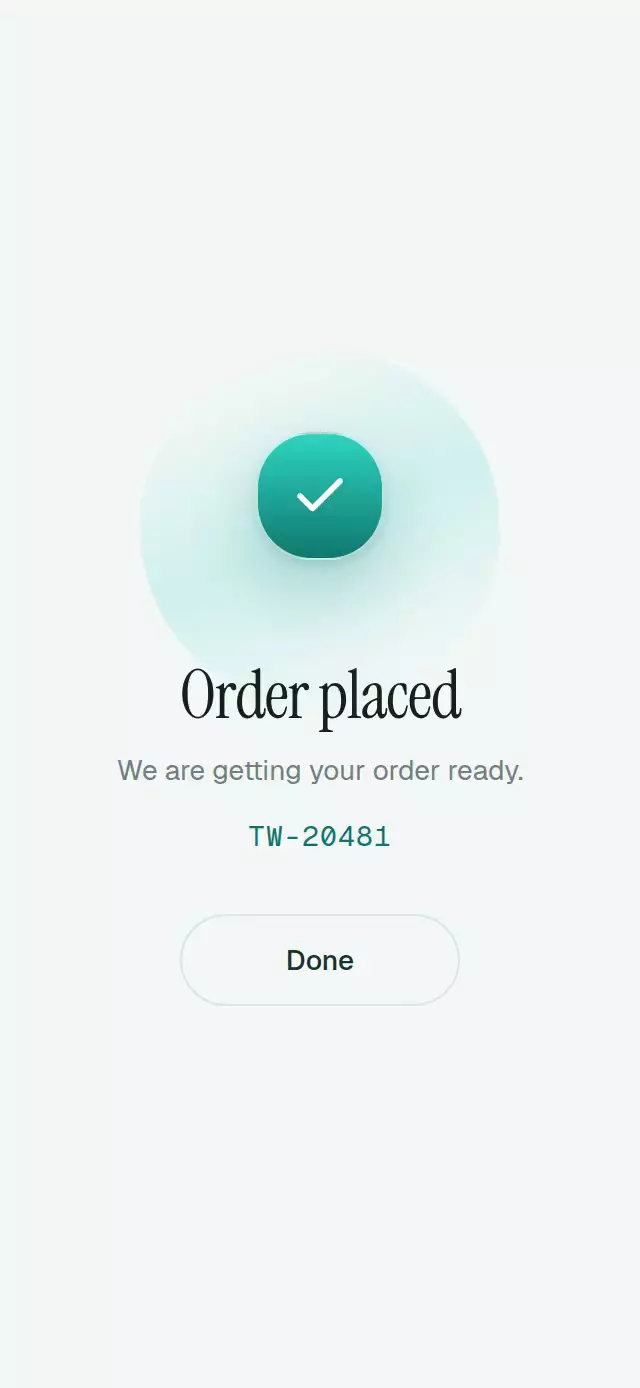
- The order action hides its label before it becomes too narrow, then morphs from a pill to a spinner and check before the confirmation burst appears.
Install
npx expo install expo-linear-gradient @shopify/react-native-skia react-native-reanimated react-native-workletsIcons: Lucide (ISC).
Usage
import { CheckoutStepper } from './checkout-stepper';

export function Checkout() {
  return <CheckoutStepper total="$86.40" />;
}
With content and personality knobs:
<CheckoutStepper
  brandName="Tidewell"
  accentStart="#2DD4BF"
  accentEnd="#0F766E"
  address="418 Alder St, Portland, OR 97209"
  orderNumber="TW-20481"
  onOrderPlaced={() => submitOrder()}
/>
Props
| Prop | Type | Default | Description |
|---|---|---|---|
brandName | string | 'Store' | Brand name shown in the checkout header. |
title | string | 'Checkout' | Checkout title. |
items | CheckoutItem[] | DEFAULT_ITEMS | Bag items. |
address | string | '418 Alder St, Portland, OR 97209' | Shipping address. |
shippingOptions | ShippingOption[] | DEFAULT_SHIPPING | Available shipping methods. |
paymentOptions | PaymentOption[] | DEFAULT_PAYMENTS | Available payment methods. |
total | string | '$86.40' | Total with free shipping; paid shipping is added when selected. |
orderNumber | string | 'OR-20481' | Order confirmation number. |
accentStart | string | '#2DD4BF' | Brand gradient start color. |
accentEnd | string | '#0F766E' | Brand gradient end color. |
fontFamily | string | undefined | Main interface font family. |
mediumFontFamily | string | undefined | Medium interface font family. |
brandFontFamily | string | undefined | Editorial brand font family. |
monoFontFamily | string | undefined | Monospaced font family for prices and order numbers. |
onStepChange | ( index: number, ) => void | undefined | Called after the active checkout step changes. |
onOrderPlaced | () => void | undefined | Called when the order confirmation finishes. |
onBack | () => void | undefined | Called when Back is pressed on the first step. |
accessibilityLabel | string | 'Checkout progress' | Accessible label for the flow. |
style | StyleProp<ViewStyle> | undefined | Optional style for the outer container. |
testID | string | undefined | Test identifier applied to the outer container. |
duration | number | 760 | Order placement spinner cycle in milliseconds. Spring physics and reduced-motion timing are unchanged. |
The forwarded ref exposes next(), previous(), goTo(index), reset(), placeOrder(), selectShipping(index), and selectPayment(index).
Compatibility
- Expo SDK 58, React Native 0.88, Reanimated 4.7, and Skia 2.14.
- iOS: supported.
- Android: supported.
- Web: supported.
- Works in Expo Go with the listed Expo-compatible packages.
Accessibility
Every step, option, navigation control, and primary action has a role, label, and state. Completed steps are reachable with 44-point targets, and changing amounts announce one current value instead of their visual rolling layers. Reduced Motion updates the connector and content immediately, removes directional travel and particles, and keeps the confirmation to a short fade.
Customization notes
Use accentStart and accentEnd for the checkout gradient.