About this component
Related guides
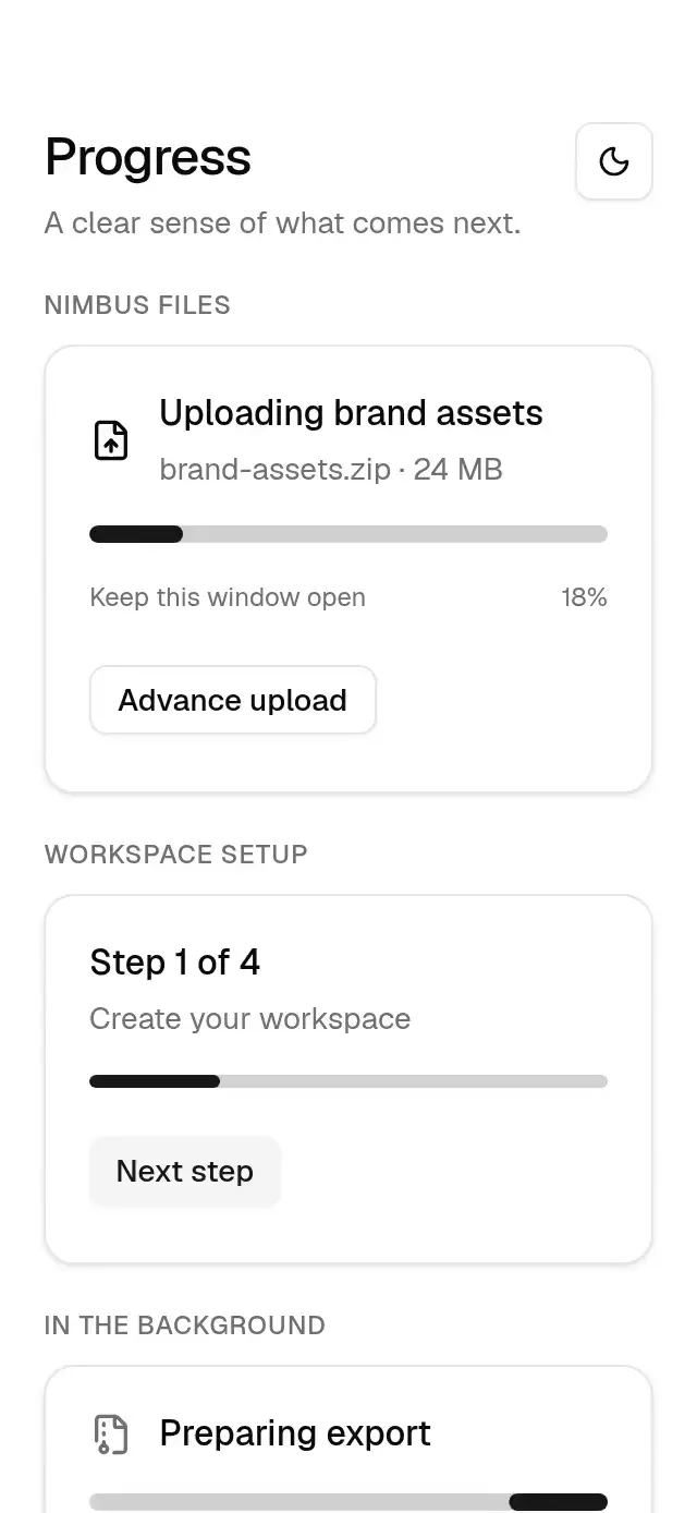
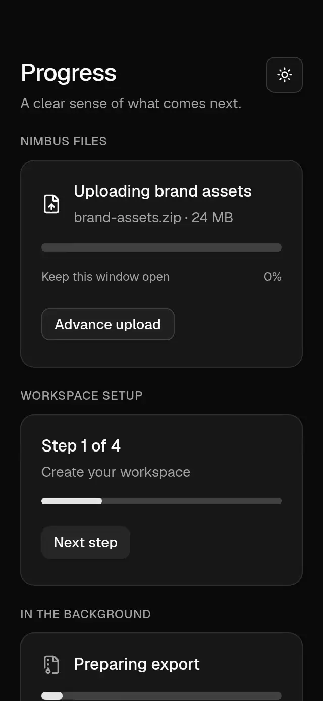
A determinate or indeterminate progress bar with animated updates and configurable value, height, and theme.
How it works
- The track uses primary at 20% opacity and a full corner radius.
- Values clamp to 0–100 and animate with the 300/35 progress spring, mass 1.
- A small relative energy threshold lets the bar settle precisely in Reanimated 4.
- Indeterminate mode moves a 40% segment across the measured track in a 1.4 second in-out loop.
Install
npx nativeanimation add base-progressThe CLI also copies base-theme. Dependencies, if you copy by hand:
npx expo install react-native-reanimated react-native-workletsUsage
import { BaseProgress } from './base-progress';

<BaseProgress value={uploadPercent} accessibilityLabel="File upload" /><BaseProgress value={75} height={6} accessibilityLabel="Workspace setup" />
<BaseProgress indeterminate accessibilityLabel="Preparing export" />The component measures its own width, so it works within cards, forms, and narrow containers. It applies no safe-area padding. Supply a label describing the task.
Wrap your app in BaseThemeProvider (from base-theme) to choose light/dark and an accent; without it, pieces use the light neutral theme. The theme prop overrides the provider. Load the font families declared in your theme once in the host app.
Props
| Prop | Type | Default | Description |
|---|---|---|---|
value | number | 0 | Progress from 0 to 100, clamped to that range. |
indeterminate | boolean | false | Shows a looping segment instead of a percentage. |
height | number | 8 | Track height in pt. |
accessibilityLabel | string | — | Accessible description of the task. |
theme | BaseTheme | provider | Overrides the shared family theme. |
style | StyleProp<ViewStyle> | — | Container style. |
testID | string | — | Stable test identifier. |
Compatibility
Expo SDK 58 · React Native 0.88 · Reanimated 4.7 · react-native-worklets 0.13. Runs on iOS, Android and web, in Expo Go and development builds. Part of Native Animation Base, a free family that shares one theme.
Accessibility
Exposes a progressbar role with min, max, and current values. Indeterminate mode exposes a busy state instead of a fabricated percentage. Reduce Motion updates determinate progress immediately and holds the indeterminate segment still.
Part of a shared foundation
Use it in a screen
Compose Base Progress with other Base components and a single shared theme. Ask your agent to read each API, then connect real navigation, state, and callbacks.
Go further.
Base covers the everyday. Choose a more expressive interaction when your app calls for it.
Streaming Skeleton Shell ↗
A streaming app shell with shared loading shimmer and card-to-hero transitions, with configurable titles, labels, colors, and fonts.
Another way to solve this task · $9Social Feed Skeleton ↗
A pull-to-refresh feed with shared shimmer and staggered post reveals, with configurable posts, labels, colors, and font.
Source code
Loading public source…