About this component
Related guides
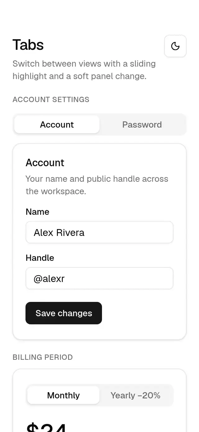
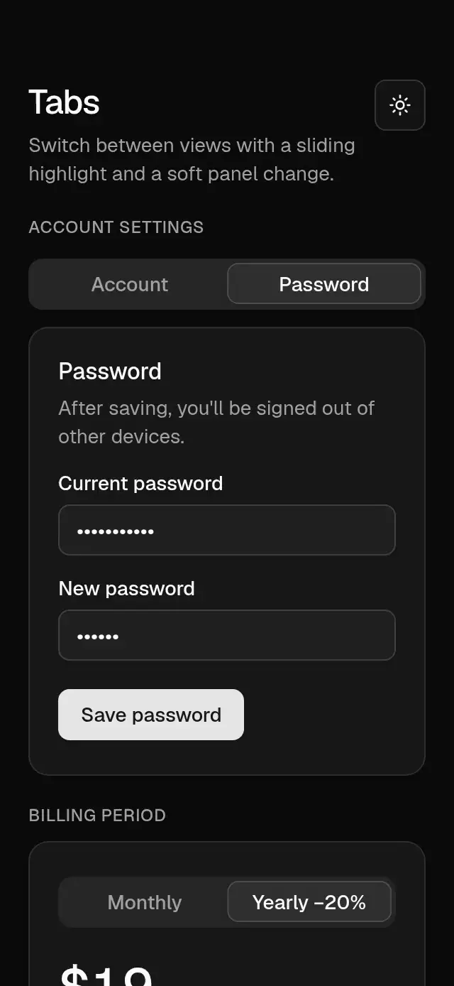
Tabs with a spring-driven highlight and shifting content, with configurable labels, panels, and theme.
How it works
- The tab list has a muted track, 3 pt padding, equal-width triggers.
- One shared value holds the selected index; the highlight's position and width derive from it with a spring (stiffness 300, damping 30, mass 1), so taps mid-motion retarget smoothly.
- Tab text fades between muted and foreground in 200 ms.
- The outgoing panel fades out in 150 ms; the new one fades in over 300 ms from a 12 pt shift in the direction of travel.
Install
npx nativeanimation add base-tabsThe CLI also copies base-theme. Dependencies, if you copy by hand:
npx expo install react-native-gesture-handler react-native-reanimated react-native-workletsUsage
import { BaseTabs } from './base-tabs';

<BaseTabs
  tabs={[
    { value: 'account', label: 'Account', content: <AccountForm /> },
    { value: 'password', label: 'Password', content: <PasswordForm /> },
  ]}
/>
Controlled, without panels (as a segmented control):
<BaseTabs value={period} onValueChange={setPeriod} tabs={[{ value: 'monthly', label: 'Monthly' }, { value: 'yearly', label: 'Yearly' }]} />Wrap your app in BaseThemeProvider (from base-theme) to choose light/dark and an accent; without it, pieces use the light neutral theme. Every piece also takes a theme prop that wins over the provider.
Props
| Prop | Type | Default | Description |
|---|---|---|---|
tabs | { value: string; label: string; content?: ReactNode }[] | — | Tabs in order. |
value | string | — | Selected tab (controlled). |
defaultValue | string | first tab | Initial tab (uncontrolled). |
onValueChange | (value: string) => void | — | Called when a tab is chosen. |
theme | BaseTheme | provider | Overrides the theme from BaseThemeProvider. |
testID | string | — | Test identifier on the root view. |
Compatibility
Expo SDK 58 · React Native 0.88 · Reanimated 4.7 · react-native-worklets 0.13. Runs on iOS, Android and web, in Expo Go
and in development builds. Part of Native Animation Base, a free family that shares one theme: install
base-theme once (the CLI does it for you) and every Base piece picks it up.
Accessibility
Announced as a tab list; each trigger reports its selected state. Triggers reserve 48 dp on Android and 44 pt on iOS/web around the 36 pt visual track, with no overlapping targets. Supports screen-reader activation and Enter/Space on web. With Reduce Motion on, the highlight and panel change instantly.
Part of a shared foundation
Use it in a screen
Compose Base Tabs with other Base components and a single shared theme. Ask your agent to read each API, then connect real navigation, state, and callbacks.
Go further.
Base covers the everyday. Choose a more expressive interaction when your app calls for it.
Collapsible Profile Tabs ↗
Profile tabs with a collapsing header and remembered scroll positions, with configurable tabs, header content, palette, and fonts.
Another way to solve this task · $9Routed Shared Element ↗
A cover-to-detail transition with a measured return path, with configurable items, labels, palette, and fonts.
Source code
Loading public source…