About this component
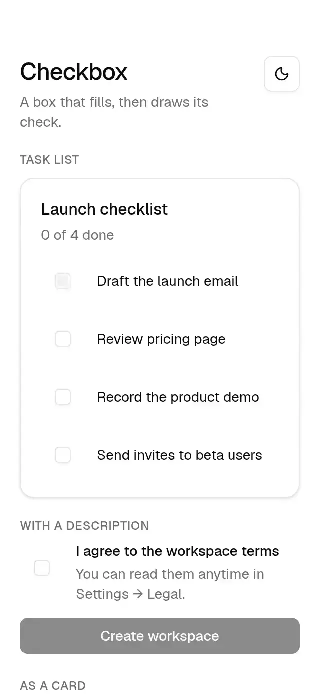
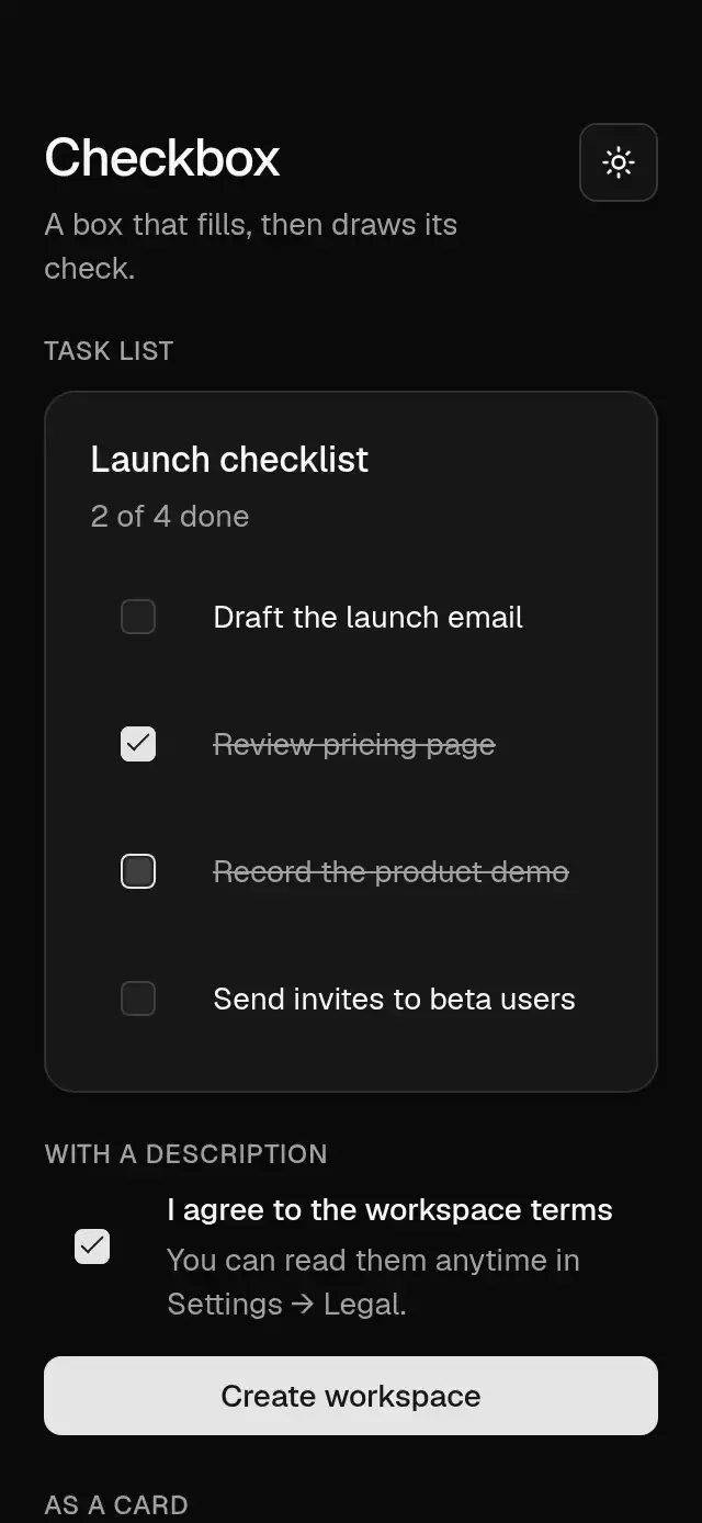
A checkbox with an animated check stroke that takes its colors and radius from a configurable theme.
How it works
- The box has a 4 pt radius,
inputborder,shadow-xs. - Checking fills the box from 70% scale in 300 ms, then draws the check after 200 ms: the short leg first, then the long one (300 ms, draw curve), with a pop spring (500/24).
- Unchecking erases the stroke in 300 ms and fades the fill out in 150 ms.
- The check is the Lucide
checkpath drawn with two views, so it needs no SVG dependency.
Install
npx nativeanimation add base-checkboxThe CLI also copies base-theme. Dependencies, if you copy by hand:
npx expo install react-native-gesture-handler react-native-reanimated react-native-workletsUsage
import { BaseCheckbox } from './base-checkbox';

<BaseCheckbox value={done} onValueChange={setDone} accessibilityLabel="Draft the launch email" />
Next to a label, as a row:
<Pressable onPress={() => setDone(!done)} style={{ flexDirection: 'row', gap: 12 }}>
  <BaseCheckbox value={done} accessibilityLabel="Accept the terms" />
  <Text>Accept the terms</Text>
</Pressable>
Wrap your app in BaseThemeProvider (from base-theme) to choose light/dark and an accent; without it, pieces use the light neutral theme. Every piece also takes a theme prop that wins over the provider.
Props
| Prop | Type | Default | Description |
|---|---|---|---|
value | boolean | — | Checked (controlled). |
defaultValue | boolean | false | Initial state (uncontrolled). |
onValueChange | (value: boolean) => void | — | Called when toggled. |
disabled | boolean | false | Dims and blocks toggling. |
accessibilityLabel | string | — | What is being checked. |
theme | BaseTheme | provider | Overrides the theme from BaseThemeProvider. |
testID | string | — | Test identifier on the root view. |
Compatibility
Expo SDK 58 · React Native 0.88 · Reanimated 4.7 · react-native-worklets 0.13. Runs on iOS, Android and web, in Expo Go
and in development builds. Part of Native Animation Base, a free family that shares one theme: install
base-theme once (the CLI does it for you) and every Base piece picks it up.
Accessibility
Announced as a checkbox with checked and disabled states, synchronized through native accessibility state and ARIA. The 16 pt box sits inside a 48 dp Android or 44 pt iOS/web target. Supports screen-reader activation and Enter/Space on web. With Reduce Motion on, the fill and check appear without animation.
Part of a shared foundation
Use it in a screen
Compose Base Checkbox with other Base components and a single shared theme. Ask your agent to read each API, then connect real navigation, state, and callbacks.
Go further.
Base covers the everyday. Choose a more expressive interaction when your app calls for it.
Vertical Range Window ↗
A vertical range control with independent handles and a draggable interval band, with configurable bounds, palette, and fonts.
Another way to solve this task · $9Document Corner Capture ↗
A document review tool with draggable corners and an image loupe, with configurable image, labels, palette, and fonts.
Source code
Loading public source…