About this component
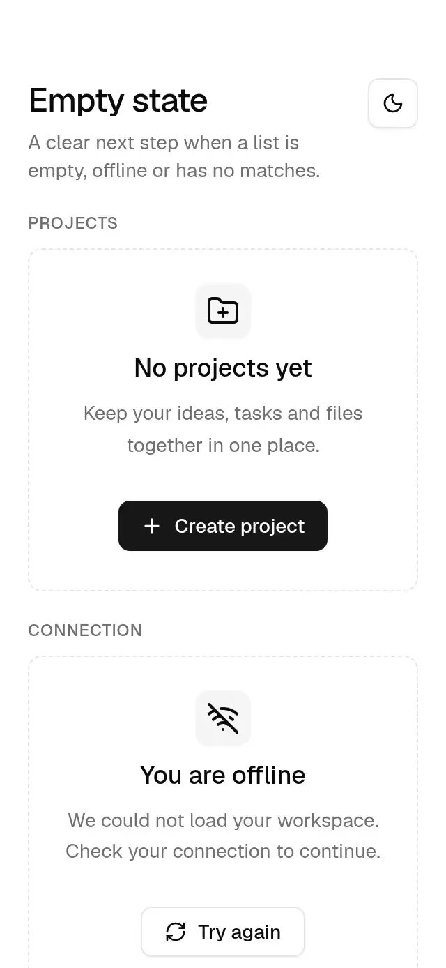
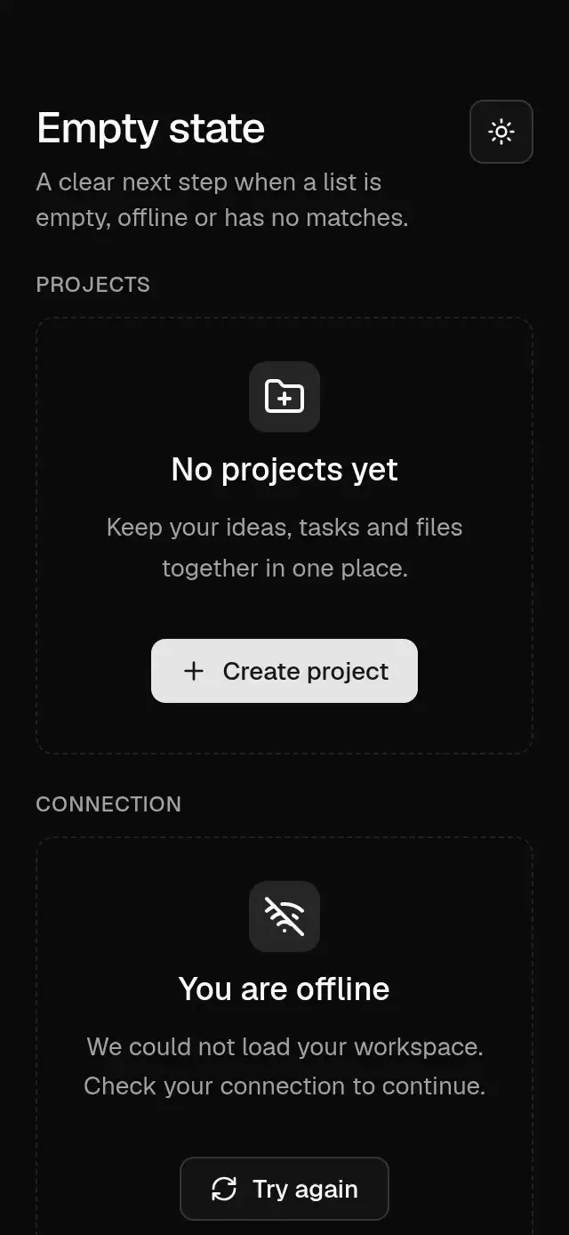
A staggered empty state with configurable icon, title, description, actions, border, and theme.
How it works
- Centered content uses 24 pt padding, a large radius and an optional dashed border.
- The 40 pt icon box sits above an 18 pt title. Descriptions and actions are limited to 384 pt.
- Icon, title, description and actions fade upward from 6 pt, staggered by 30 ms over 300 ms.
- The icon also springs from 0.9 to 1 with stiffness 200, damping 20, mass 1.
Install
npx nativeanimation add base-empty-stateThe CLI also copies the family modules listed in registryDependencies. Dependencies, if you copy by hand:
npx expo install react-native-reanimated react-native-workletsUsage
import { FolderPlus } from 'lucide-react-native';
import { BaseEmptyState } from './base-empty-state';
import { BaseButton } from './base-button';

<BaseEmptyState
  icon={<FolderPlus size={24} color={theme.colors.foreground} />}
  title="No projects yet"
  description="Keep your tasks and files together in one place."
  actions={<BaseButton onPress={createProject}>Create project</BaseButton>}
/>
Wrap your app in BaseThemeProvider (from base-theme) to choose light/dark and an accent; without it, pieces use the light neutral theme. Every piece also takes a theme prop that wins over the provider.
Props
| Prop | Type | Default | Description |
|---|---|---|---|
icon | ReactNode | — | Icon inside a 40 pt muted box; supply a 24 pt icon in foreground color. |
title | string | — | Required heading. |
description | string | — | Supporting explanation. |
actions | ReactNode | — | Actions arranged in a wrapping centered row. |
bordered | boolean | true | Shows the dashed border. |
theme | BaseTheme | provider | Overrides the theme from BaseThemeProvider. |
style | StyleProp<ViewStyle> | — | Container style. |
testID | string | — | Stable identifier on the root view. |
Compatibility
Expo SDK 58 · React Native 0.88 · Reanimated 4.7 · react-native-worklets 0.13. Runs on iOS, Android and web, in Expo Go
and in development builds. Part of Native Animation Base, a free family that shares one theme: install
base-theme once (the CLI does it for you) and every Base piece picks it up. Free forever. MIT.
Accessibility
The title is a heading and the decorative icon is hidden from screen readers. Caller-supplied actions keep their own labels and semantics. With Reduce Motion on, content appears immediately without staggering, translation, or scaling. The included demo uses Base buttons for its actions.
Part of a shared foundation
Use it in a screen
Compose Base Empty State with other Base components and a single shared theme. Ask your agent to read each API, then connect real navigation, state, and callbacks.
Go further.
Base covers the everyday. Choose a more expressive interaction when your app calls for it.
Stacked Category Cards ↗
A category stack whose tabs unfold into detail cards, with configurable categories, title, colors, and fonts.
Another way to solve this task · $9Review Approval Card ↗
A moderation queue with swipe-to-approve or decline feedback, with configurable reviews, labels, colors, and fonts.
Source code
Loading public source…